
Whether you are tuning for high-performance motorsport or servicing daily drivers, gathering accurate data starts with a reliable shock dyno. In this guide, we will break down exactly how to interpret the testing results.
Table of contents:
- Key Terminology in Reading Suspension Graphs
- Before You Start: Test Setup & Repeatability
- What Is a Suspension Dynamometer?
- LABA7 Shock Dyno Software
- Suspension Graphs Explained
- Why Suspension Graphs Matter?
- Common Fault Signatures & Likely Causes
- How to Use Suspension Graphs for Performance?
- Conclusion
- Frequently Asked Questions
Key Terminology in Reading Suspension Graphs
In this section, we will cover some of the basic terminology used when working with our dynamometers. If you are an experienced user, feel free to skip to another section.
Shock
What it is, what it does, what shock damping is, how does damping work, and other questions we covered in detail in our exhaustive guide to shock absorbers?
But in short, a shock (shock absorber, fork, or damper) is part of a car, bicycle, or motorcycle suspension. Whatever the name, its purpose is to reduce shocks and vibrations caused by uneven roads thus improving the handling and comfort of a vehicle.
Dynamometer
Also called dyno for short. By definition, dyno is an instrument that measures the power output of a motor. Dynamometers are used to test various parts or components and help diagnose issues or assure quality.
Suspension dynamometer
A suspension dynamometer (or a shock dyno) designed specifically for shock absorbers records damper force, displacement, and velocity across a controlled stroke cycle. Damper force, displacement, and velocity data are recorded across a controlled stroke cycle to evaluate performance and identify faults.
Suspension graph
A dyno graph is the most convenient and easy-to-understand way to represent the results of a shock absorber test.
The LABA7 data logger records information at 64,000 samples per second. Providing the results in any other format would be impossible for humans to understand, not to mention identify if there are any issues.
Our software accumulates all data entries and represents them in graphs where the performance of the shock absorber can be easily evaluated.
Sometimes, people call them dyno sheets. Especially, if they are printed out.
Scotch-Yoke mechanism
It translates the rotational motion of the motor into the vertical linear motion of the shock absorber. The Scotch-Yoke mechanism can be considered a sign of quality as it greatly improves the accuracy of the data the dynamometer collects.
Oscillation
It means moving back and forth in a regular rhythm. For example, shock absorbers act to dampen the oscillation of the spring.
Hysteresis
Hysteresis in dyno graphs refers to the difference between the damping force during compression (or rebound) and the damping force during the return motion at the same velocity. It indicates energy loss within the shock absorber system, usually due to friction, fluid dynamics, or mechanical inefficiencies.
In the graphs, hysteresis is shown by the separation of the two lines in the graph. Below you will find dyno graphs that illustrate hysteresis.
Before You Start: Test Setup & Repeatability
A consistent test setup is the foundation of reliable dyno graph analysis. Without repeatability, comparing results becomes guesswork.
Mounting the Shock Correctly
Ensure the shock absorber is mounted securely and aligned properly in the dyno. Misalignment introduces side loads that skew force readings on your shock chart.
Set the Correct Stroke and Speed
Match the test stroke and velocity to real-world operating conditions. Most LABA7 users start with moderate speeds (50–100 mm/s) before progressing to higher velocities.
Warm-Up Procedure
Cold oil behaves differently from warm oil. Run a few cycles at moderate speed to bring the shock to operating temperature before recording. This step is critical for repeatable results when you read a dyno graph.
Document Your Settings
Record stroke length, test speed(s), ambient and shock temperature, adjuster positions, date, and shock ID for every test. Consistent documentation allows meaningful comparison of dyno graphs over time.
Check for External Variables
Ensure no loose fixtures, electrical interference, or nearby vibrations affect readings. A stable environment produces the most reliable dyno sheet results.
What Is a Suspension Dynamometer?
A shock dynamometer is a vital tool for evaluating and improving suspension performance.
It measures the rebound and compression forces of a damper and helps to identify if it has any issues and correct them. This makes the suspension dyno a must-have tool for building, rebuilding, or tuning suspension.
For drivers and riders who seek top performance in any competitive event, dyno is basically irreplaceable. It allows them to fine-tune their suspension and, as a result, achieve better times.
With correct adapters LABA7 dynos can test any shock absorber on Earth. Whether they are used in bicycles, motorcycles, cars, trucks, buggies, or any sports vehicle.
Visit this page if you are looking for a shock dyno for sale.
LABA7 dyno software

LABA7 software is developed with the user in mind. The software is intuitive and easy to use. At the same time, it has all the features and delivers the most accurate data in the market. And it runs on Windows OS!
Here is how the LABA7 hardware and software work:
During the test, the Scotch-Yoke mechanism creates shock-absorber oscillation. The load cell of the dyno captures the damper’s rebound and compression force data, while a high-precision displacement sensor monitors the travel of the shock absorber.
All data is then collected by our in-house developed data logger. Tens of thousands of data points every second are processed (no phase shift) and sent to the software on your computer.
It is important to stress that data is sent in real-time over WiFi. It means that you can track and analyze the performance of the shock as it happens.
When LABA7 software receives the data it generates dyno graphs on your screen. The operator of the dyno can detect and fix malfunctions or tune the suspension to perfection.
All details on how to read graphs you can find in the section dyno graphs explained.
Features
LABA7 software includes several tools designed to improve accuracy and streamline your workflow when reading graphs.
Zero tare
Before we start explaining how to read graphs, it is very important to note that the dyno must reset the sensor at the right spot. This avoids dyno graphs being offset and inaccurate.
LABA7 shock dyno software does this automatically, so our graphs are always spot on.

Gas pressure elimination / Spring elimination
Another smart feature we have implemented is spring elimination. It helps when you are measuring air spring forks or motocross bike forks.
Moreover, you can measure theoretical gas pressure in the shock and eliminate it from the graphs.

Print reports
With LABA7 software you are able to print your graphs (even the comparison of graphs) by a press of a few mouse buttons.
You can upload your company logo and contact details as well!

Suspension graphs explained
Below you will find tips on how to read dyno graphs. All graphs were generated by LABA7 software during a single test. Not only that – we explain how it is measured, how to interpret the results and share our tips to achieve the most accurate results.
As these graphs are real examples of actual tests we concluded, what else can be better material to learn about dyno graphs?
Temperature Vs. Time
The LABA7 software offers a practical feature: a live temperature graph. Temperature measurements are taken by an infrared sensor with an accuracy of 0.5°C. Reading is done every 1 second on the graph.
This functionality proves particularly useful for evaluating how well your shock absorber handles temperature dissipation at different speeds.
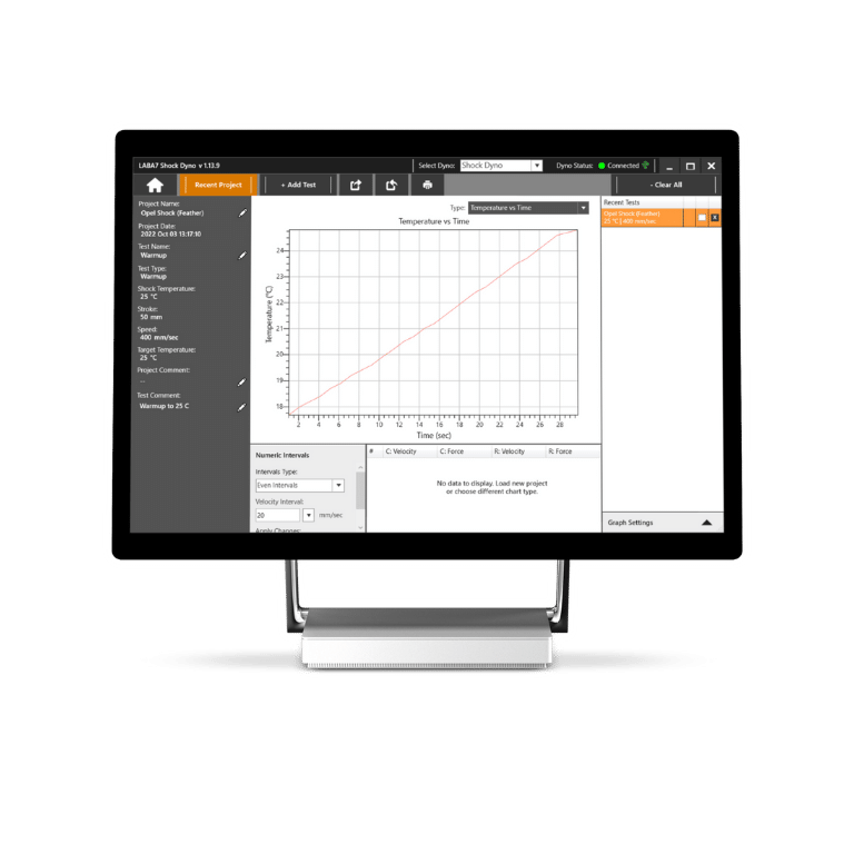
Main applications of the temperature graph:
- Preparing the shock absorbers. Before conducting tests, it’s important to warm up the shock absorbers to their optimal working temperature. This ensures reliable and accurate results during the testing process.
- Monitoring temperature buildup. The graph allows you to observe how quickly the shock absorber’s temperature increases. This information helps assess its performance under various conditions and provides insights into heat accumulation.
- Identifying issues at high temperatures. By analyzing the temperature fluctuations on the graph, you can detect issues that may arise when the shock absorber reaches high temperatures. This helps you to identify the cause of the malfunction and fix it.
To ensure accurate measurements, remember these important notes:
- Avoid measuring on glossy surfaces, as they can affect the accuracy of the infrared sensor’s readings.
- Position the sensor to face the body of the shock absorber, enabling it to capture temperature variations accurately.
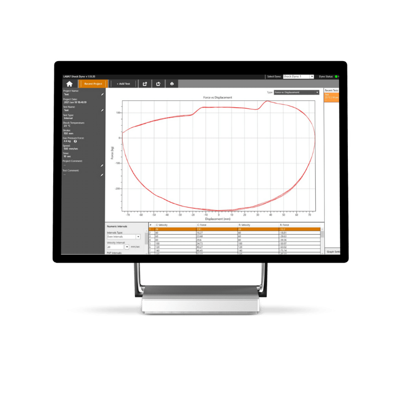
Force vs. Displacement
For dyno operators, the Force vs. Displacement graph is the most diagnostic of all. It shows the full motion of the shock absorber and can help identify the majority of the potential issues.
In Force Vs. Displacement graph the force is shown on the vertical axis and displacement – on the horizontal. The graph portrays the force a shock generates when it travels through its motion in both the compression and rebound damping phases.
This graph is mostly used to diagnose the health and consistency of a damper and should be treated as the most important graph.
Example of a good dyno graph
The image below displays Force Vs. Displacement graph of a healthy shock absorber. When analyzing this graph, we want to see a smooth consistent line forming an oval or circle.

Example of a bad dyno graph
If the graph has any major downward/upward peaks or drop-offs this shows that there is a drop in damping force and that the damper becomes less effective during that stroke.

Inconsistencies in the graph can arise from various factors. For example, it can happen due to mechanical wear or loose components within the shock absorber, as well as oil cavitation. Another critical aspect to consider is nitrogen pressure. Incorrect pressure levels can lead to inconsistent forces.
It is important to note that there are exceptions to the presence of upward peaks on the graph. This usually concerns shocks with internal/external bypass valves or hydraulic bump and rebound stoppers. When running a dyno, you will see a sudden rise of damping force in compression and that is OK.
Progress tracking
The data logger samples data on shock absorber performance tens of thousands of times per second. It allows for our software to show exactly where malfunctions occur in the shock’s stroke cycle. Moreover, users can compare graphs before and after repair with a few mouse clicks.
The graph changes when the oil temperature rises
LABA7 software does not average the force versus displacement graph into one graph. Instead, it presents them with hysteresis, allowing for the tracking of shock consistency even as the oil temperature rises.

When to use the Force versus Displacement graph
- Use the graph when building, servicing, or tuning a shock absorber to diagnose if it performs within proper tolerances.
- Compare graphs before and after shock rebuild or after revolving.
- See the live temperature of the shock and how it changes during the test.
Force vs. Velocity
When you are building, servicing, or tuning a shock, it is very important to know how to read velocity graphs. It helps you to determine the quality of the tested shock. In this and the following sections, you find velocity graphs explained in detail.
So, what does it show? As the dyno runs through a series of velocities, it records and plots the force corresponding to each velocity.
LABA7 software generates a Force vs. Velocity graph that shows the force on the vertical axis and the velocity on the horizontal axis. The shape of the curve allows you to assess the shock’s quality.
A well-constructed shock will produce a curve with a very little hysteresis gap between the “compression-acceleration/deceleration” and “rebound-acceleration/deceleration” portions of the curve. The image below demonstrates it.

LABA7 software allows you to see a combined force vs velocity graph. This feature comes in handy when the hysteresis of forces is big and there are too many lines in the graph.

However, not all shocks will give you a nice force vs velocity graph. As you can see in the image below, this shock absorber is not in great shape.

Force vs. Avg. velocity
The Force vs. Avg. velocity graph takes the F/V “loop” and averages the accelerating and decelerating forces to produce a single line for each velocity data point. It should look similar to this graph.

This graph serves multiple purposes. It allows comparison of different shocks, analyzing the impact of adjusters or valving modifications, and ensuring proper matching of shocks between the left and right sides.
When examining it, it is essential to ensure that the hysteresis gap on the Force vs. Velocity graph is narrow. It ensures the validity of the Force vs. Avg. velocity graph for these applications.
However, beware of shocks with distorted Force vs. Velocity graphs! In such a case, the Force vs. Avg. velocity graph will hide underlying faults or issues within the shock.
That is why we highly recommend analyzing both velocity graphs when testing and diagnosing a shock absorber.

When to use Force vs. Avg. velocity graph:
- When comparing shock absorbers to one another.
- Track and understand the effects of adjusters or valving changes.
- Match shocks left to right.
PVP (Peak Velocity Plot)
The Peak Velocity Plot is also called a Peak Force-Velocity graph. It is useful for setting up dampers or comparing the main force they generate.
Here’s what you need to know:
- The graph shows the relationship between the maximum speed of the damper and the force it produces at that speed.
- However, remember that there is only one data point for each peak speed. This means we only record the force when the damper reaches its highest speed during the test.
- To create a full picture of the force generated by the damper at different speeds, we need to run multiple tests at increasingly higher speeds. By doing this, we can gather data points at different velocities and construct a curve that shows how the force changes as the speed of the damper increases.
The Peak Force-Velocity graph helps us understand how the force produced by a damper changes as its speed increases. To get a complete picture, we need to conduct several tests at different speeds and use the data to create a curve that shows the relationship between speed and force.

Force vs. Time
A force vs time graph can be useful when you only want to see force measurement. It eliminates any data inaccuracies caused by the position sensor. Also, this graph is provided with less “smoothing” algorithms.
In this graph, you will be able to see even the smallest force fluctuations.

Why Suspension Graphs Matter?
Graphs provide essential data for anyone looking to fine-tune suspension setups. They help:
- Identify performance inconsistencies
- Optimize damping characteristics for specific conditions
- Compare different shock settings
- Diagnose mechanical issues before they become performance problems
- Improve R&D efficiency by providing repeatable, data-driven results
Common Fault Signatures & Likely Causes
| Fault Signature | What It Looks Like | Likely Causes |
| Cavitation spikes | Sharp, erratic peaks at high velocities | Low nitrogen pressure, insufficient oil, worn seals |
| Asymmetric oval | Flattened or distorted Force vs. Displacement shape | Worn valving, contaminated oil, internal failure |
| Excessive hysteresis | Wide gap between compression and rebound curves | High friction, incorrect oil viscosity, worn bushings |
| Force drop-off at stroke ends | Sudden damping loss near full compression/extension | Gas pressure loss, seal bypass, low oil fill |
| Inconsistent loops | Different curve shape each cycle | Loose components, oil aeration, thermal instability |
| Flat damping curve | Very low forces across all velocities | Blown seals, depleted gas charge, worn valving |
| Mid-stroke force spike | Sharp force increase at specific displacement | Internal debris, bent shaft, hydraulic lock |
Pro Tip: Always cross-reference Force vs. Displacement with Force vs. Velocity graphs—some faults are more visible on one shock chart than another.
How to Use Suspension Graphs for Performance?
Knowing how to read dyno graphs is only the first step. Applying that knowledge strategically transforms raw data into measurable performance gains.
- Before making any changes to shock absorbers, run initial tests to establish a baseline.
- Test shocks with various settings and compare graphs to find optimal damping curves. Using LABA7 shock dyno software, it is very easy to do, as it’s shown in this video.
- Use a temperature graph to track to ensure consistent performance and repeatable results.
- Make informed adjustments to damping rates based on graph insights, rather than relying on trial and error.
- Investing in a high-quality models, such as LABA7, ensure accurate data for better decision-making.
Conclusion
Understanding dyno graphs is essential for optimizing suspension performance, whether for racing, off-road applications, or everyday use. These graphs provide key insights into damping behavior, helping engineers, tuners, and mechanics fine-tune shock absorbers for maximum efficiency and consistency. By leveraging dyno data, you can make precise, informed adjustments that translate to better ride quality, improved handling, and overall enhanced vehicle dynamics.
For more insights into suspension testing technology, visit our website or contact our team of experts.
—
Frequently Asked Questions
What does a “good” suspension graph look like, and what patterns signal problems?
A good dyno graph shows smooth, consistent curves without spikes or flat spots. The Force vs. Displacement graph should form a nearly symmetrical oval (tops may be flatter and bottoms elongated—or vice versa—in some designs; slight left/right differences are normal). Force vs. Velocity should display a tight hysteresis loop. Jagged lines indicate cavitation, asymmetric shapes suggest worn valving, and flat sections point to seal or gas pressure failure.
How much hysteresis is acceptable when you read a suspension graph?
Hysteresis should be as minimal as possible in high-performance shocks, with the smallest gap between accelerating and decelerating force curves. Excessive separation often signals friction, worn seals, or incorrect oil viscosity. Always compare shock graphs under identical test conditions.
Do I need to normalize temperature when learning how to read a dyno graph and compare runs?
It depends on your test goals—for example, testing cold-shock behavior may not require it. For consistent damping comparisons, however, warm shocks to a stable temperature (typically 30–40°C) before recording, and always document temperature. Without this, thermal changes can mimic mechanical faults on your shock chart.
Which graphs are best for matching left and right shocks, and why?
The Force vs. Average Velocity graph works best for matching shocks. It averages forces into a single line, making side-by-side comparison straightforward. However, always verify both shocks have acceptable Force vs. Velocity graphs first—the averaged view can hide underlying faults in a dyno graph.
Thank you for visiting this article about how to read suspension graphs successfully!
You also might like these articles: